Why local faces, places, and paper still hit hardest.
What Makes Print Feel Personal?
Ever notice how we’ll breezily delete hundreds of emails every day but yet our junk mail piles up on the counter?
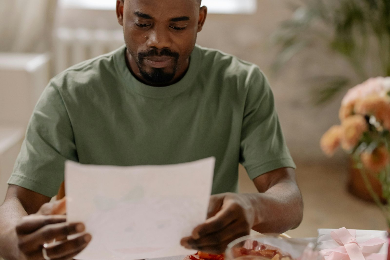
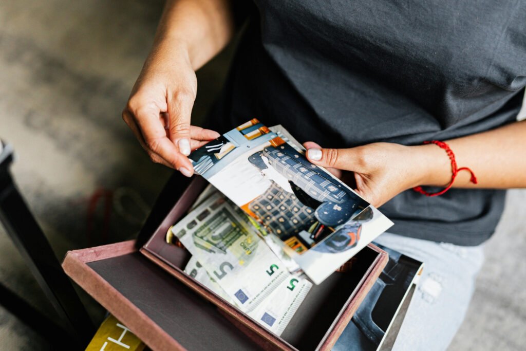
It’s the same reason we’ll abandon entire photo albums when switching phones—but somehow, a faded event flyer still hangs on the fridge, along with a pic from a work event three jobs ago.
It’s not a fluke. That’s just print, doing its thing. And our actions are instinctual.
There’s something about seeing familiar faces and landmarks in print that sparks a sense of connection—something social, emotional, and often unconscious. Research suggests this reaction is wired deep in our brains. And when it’s thoughtfully designed, that emotional bond can help elevate a message, call people to action, and strengthen community.
The Research: Why Print Hits Different
In recent years, neuroscience-backed studies have shown what many people already feel to be true: print makes a stronger emotional impact than digital.
A 2015 study by the USPS and Temple University found that participants experienced more emotional engagement and greater subconscious value when interacting with printed materials compared to digital ads. Physical mail also triggered activity in areas of the brain associated with memory and desirability.
That same year, Canadian firm TrueImpact conducted a similar study using EEGs and eye-tracking. Their findings?
- Printed materials required 21% less cognitive effort to process
- People had a 70% higher recall rate for physical ads, even a week later
In short:
🧠 Print is easier to absorb
💡 Print is easier to remember
❤️ Print is easier to love
These effects become even more powerful when people recognize something personal: a mural they pass every day, a school they attended, or a face they know from their block. Design choices that tap into familiarity create emotional relevance—and that’s where print shines brightest.
Emotion by Design
One of the most effective ways to spark emotional connection through print is to reflect the actual community you’re trying to reach.
We’ve seen powerful results from:
- Featuring real people (not stock models) from the neighborhood
- Highlighting local landmarks—churches, parks, murals, corner stores
- Collaborating with local artists to design posters and flyers
- Using language and references that speak directly to the community
These elements build a sense of belonging. In places where people already feel overwhelmed or overlooked, print can say: You matter. This is yours.
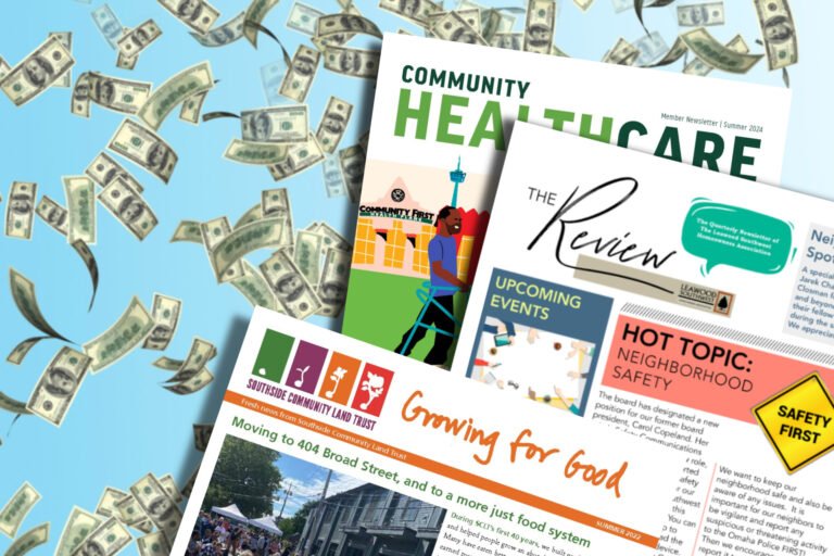
Practical Applications
Whether it’s a simple flyer or a full-length newsletter, emotionally grounded design can help messages resonate—and stick.
Here are a few ways we’ve seen this approach work:
- A “Meet the Manager” poster in Oxford Borough featured a welcoming photo taken on a neighborhood street. Attendance at the event more than doubled expectations.
- Every cover of The Local, a free newspaper in Northwest Philadelphia, features original art by a community artist highlighting a current event or issue. Many readers have taken to collecting these covers, as well as clipping and saving favorite stories.
- In 2024, WHYY partnered with a well-known artist via Philly Artblog on a full-color, illustrated poster that brought COVID education to many creative community spaces.
- For nonprofit clients, using real portraits and recognizable backdrops in print materials is a time-tested way to build trust and foster authentic connection.
These aren’t just nice designs. They’re emotional doorways—print that invites people to pause, reflect, and come together.
Worth Remembering
It’s true in any medium: if you want people to engage with your message, make them feel it.
Print gives you tools that digital can’t match: physical presence, emotional resonance, and staying power.
👋 Thanks for stopping by—glad you found us.
This blog is powered by East Falls Media, where we help small businesses, nonprofits, and local governments communicate with clarity and purpose.