Anyone who works in municipal or nonprofit communications knows this moment well: you’ve written something carefully, you’ve checked it for accuracy, you’ve shared it through the proper channels — but no one uses it. The questions keep coming in anyway. The feedback isn’t right.
Messaging can be tricky, especially when you’re trying to reach a wide audience with different interests, hurdles, and lived experiences shaping how information is received. When people feel overwhelmed or unsure where to begin, it’s easy for them to disengage rather than dig in.
Over the years, through our work with community organizations and by publishing a grassroots newspaper, we’ve learned that one of the most effective ways to help messaging land with a broad, diverse readership is through thoughtful visual support. Graphics don’t replace clear writing, but they often provide the structure readers need to orient themselves before the words can do their work.
Visual tools like flowcharts and starter guides don’t just explain programs or procedures — they create humane on-ramps into systems that might otherwise feel intimidating or opaque. Used well, they offer readers a place to pause, get their bearings, and move forward with greater confidence.
A Faster Way In
Most civic and nonprofit systems are built carefully and with good intentions, but they are also layered. Policies build on one another, programs intersect, and eligibility or participation often depends on conditions that aren’t immediately obvious to newcomers.
Dense paragraphs, long PDFs, or web pages that require extensive scrolling all ask readers to hold too much information in their heads at once, especially when they’re already unsure whether something applies to them. Without an obvious entry point, many readers simply give up.
Visual tools reduce the mental effort required for readers to find their bearings. They can scan for the gist, understand the overall shape of a process, and decide whether and when to dig deeper. Just as importantly, clear visuals make it easier for people to bookmark a resource with confidence, knowing they can return later and pick up where they left off.
Welcoming Signs
In community-centered communications, visual tools are invitations to engage. A well-designed flowchart or starter guide signals that someone anticipated confusion and chose to address it directly. Such a gesture conveys support and consideration. It also encourages participation.
We’ve seen this repeatedly in our own work. When organizations add a simple visual overview alongside detailed instructions, questions don’t disappear entirely, but they’re more specific. Instead of “How does this all work?” it’s more like “Am I at Step A or Step B?” and “Can you clarify who qualifies for Option C?”
At their best, visual tools acknowledge that participation takes effort, and that effort deserves respect. They operate as a professional courtesy, one that pays back over time through more productive conversations, steadier participation, and stronger outreach.
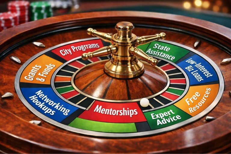
Leading with Flowcharts
While we often associate flowcharts with internal operations, they can be especially powerful when shared outward-facing, particularly in civic or nonprofit contexts. A good flowchart assumes no prior knowledge; it simply walks the reader through a series of questions, each one narrowing the path forward.
For residents, this might look like a chart that answers, “Is this program for me?” For vendors or applicants, it might clarify eligibility or next steps. For volunteers, it might outline how to get started based on availability or interests. In each case, the goal is the same: replace uncertainty with direction.
What makes flowcharts effective is their neutrality. They don’t require readers to decode policy language or guess which section applies to them. They allow people to follow a path without feeling evaluated, which can be especially important when topics involve finances, compliance, or public services.
When designing flowcharts for community use, restraint is key. Each decision point should answer one clear question, and the chart should be readable without zooming or scrolling excessively. If a flowchart begins to feel crowded, that’s a sign that it’s trying to do too much at once — a common pitfall we’ll return to later.
Starter Guides: Set Up for Success
Starter guides serve a slightly different purpose. Where flowcharts help people decide whether and how to proceed, starter guides help them understand what to expect once they do. These guides are especially useful for onboarding: new volunteers, first-time applicants, newly registered vendors, or residents engaging with a service for the first time.
A strong starter guide doesn’t aim to be comprehensive. Instead, it establishes boundaries and sequence. It answers questions like: What is this? What do I need before I begin? What happens first, and what comes later? Who do I contact if I get stuck?
People appreciate being told what not to worry about just as much as what they should focus on. A starter guide that says, “You don’t need to understand everything on day one,” does more to lower anxiety than one that tries to cover every detail upfront.
When organizations invest in thoughtful starter guides, they often see fewer drop-offs early in the process. People feel more sure-footed because the road ahead looks navigable, even if it’s still challenging.
Demystified, Not Oversimplified
It’s a common misconception that visual tools “dumb down” content, when in practice the opposite is usually true. Well-designed visuals don’t remove complexity — they organize it. They help readers take in information in stages, rather than confronting everything at once.
You don’t need to be familiar with formal theories to recognize how this works. We all know the feeling of fatigue that sets in when we’re faced with a wall of text demanding our full attention. Visual tools counteract that reaction by introducing structure and giving readers something to hold onto — relationships, sequences, and boundaries that provide context as they go. The work becomes more manageable, making it easier for readers to stay with the process from start to finish.
This is particularly important in community work, where audiences may be navigating multiple stressors at once. Smart visuals are more than just a design choice; they’re an accessibility tool that opens the door to participation.
Budget-Friendly Bag of Tricks
You might assume that creating visual guides requires specialized software or professional design expertise. While outside support can certainly be helpful, there are plenty of approachable, low-cost apps that make it possible to start small and learn as you go.
Canva
Canva is widely used for a reason. It offers accessible templates for flowcharts, one-pagers, and simple diagrams, making it easier to focus on content rather than layout. For community-facing materials, the key is restraint: stick to a limited color palette, prioritize legibility, and treat templates as starting points rather than finished products.
Canva’s popularity also means there’s no shortage of up-to-date tutorials available on YouTube, which is often the fastest way to get comfortable with new features as the platform evolves. For nonprofits, it’s also worth noting that Canva Pro is available FREE to registered 501(c)(3) organizations.
Google Slides
Google Slides is often overlooked as a tool for visual communication, but it’s surprisingly effective for creating simple diagrams and starter guides. Its built-in grid system and alignment guides make it easier to organize information clearly, even without a design background.
Because files are easy to share, duplicate, and revise, Slides works especially well in collaborative environments where multiple staff members may need to update materials over time. As with Canva, a quick search for recent tutorials can help teams pick up efficient workflows without committing to formal training.
Lucidchart
Lucidchart’s free tier offers more robust diagramming tools than general design platforms, making it a good option for more complex flowcharts. It’s particularly useful when the accuracy of relationships matters more than visual polish.
The learning curve is slightly steeper than with simpler tools, but short tutorial videos can help teams get a feel for the platform and decide whether it’s the right fit for their needs.
Miro
An AI-powered “innovation workspace,” Miro excels as a platform for collaborative planning. While it may be less suitable for final, public-facing materials, it’s an effective environment for team discussion, as a first step to translating ideas into polished visuals. Many people find that mapping a process together first helps surface gaps or assumptions that might otherwise make their way into public documents.
Across all of these tools, the principle remains the same: start by organizing the information itself, then use design to walk audiences through your reasoning.
Common pitfalls to avoid
As helpful as visual tools can be, they don’t work by default. One common mistake is trying to fit too much into a single visual. When a flowchart or guide becomes crowded, it recreates the very overload it was meant to prevent. In those cases, splitting content into multiple visuals — or pairing a high-level overview with a separate, more detailed document — often works better.
Another pitfall is designing primarily for staff convenience rather than audience experience. What makes sense internally may not be intuitive from the outside. Testing visuals with someone unfamiliar with the process, even informally, can quickly reveal where assumptions are hiding.
Finally, it’s important to remember that visual tools don’t replace human contact — they support it. Clear visuals make conversations more productive, but they should always include prominent contact information and an invitation to ask questions when needed.
The Long View on Visual Communication
Clarity builds trust slowly, through repetition and care. Visual tools are part of that ongoing work, evolving as programs change, audiences shift, and organizations learn from experience and feedback.
We’ve made our share of missteps along the way, and many of our most useful insights came from revisiting materials that didn’t work as well as we hoped. Each revision sharpened our understanding of what people actually need in order to move through complex systems with less hesitation.
Every positive experience builds a little good faith, and over time those moments shape how people relate to an organization and whether they feel inclined to return, engage, or move forward.
Worth Remembering
When flowcharts and starter guides are done well, they rarely draw attention to themselves. They simply make things easier. For municipal staff and nonprofit teams juggling limited time and resources, that ease can mean fewer barriers, better conversations, and more meaningful engagement.
If you’d like help planning or preparing impactful visual tools, reach out. We offer a short, structured diagnostics interview — about 15 minutes — where we ask a focused set of questions designed to clarify what you’re trying to convey and where visuals could be most effective.
It’s meant to be practical, informative, and useful. Pay what works (suggested rate $15).
This blog is powered by East Falls Media, where we help small businesses, nonprofits, and local governments communicate with clarity and purpose.